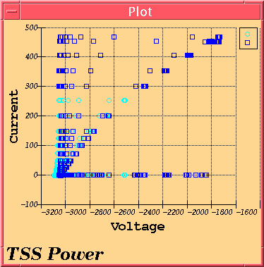

A correlogram is also known as a scatter plot and this program can create one from two independent IDFS sources. Furthermore, multiple lines may be plotted on a single graph. The Correlogram programs offers a plethora of options for refining the graph such as the ability to switch from cartesian to polar, linear to log; multiple fonts, colors, and symbols, etc...
The program can also export the information to ASCII suitable for inportation into other scientific plotting programs or spreadsheets.
Even with all the options available, the Correlogram is one of the easiest to get started. Simply click "Add" and select two sources to use. Select a set of Units if applicable and then pick a time set. If real time, simply check off the appropriate box. If you wish to use the same time period for both axes, there is a box one can click to supply the same time for both axes.
After that, click "Ok" and then select "Output" and then "Draw". Data collection might take a bit of time (especially with a large sample), but eventually, a plot should come.
There are few limitations of Correlogram. Bugs were squashed from the previous version.
Time is automatically rectified if you pick the same time for both axes. If you do two seperate times, you get one X data point per Y data point. If the times are the same, you will get as many X points in the same time period for every Y point and vice versa.
The plots are totally different.
Keep this in mind when doing plots.
The source(s) in this case are IDFS data sources. Correlograms require two independent IDFS sources; each on its own axis. With each source is an associated units modifier and time.
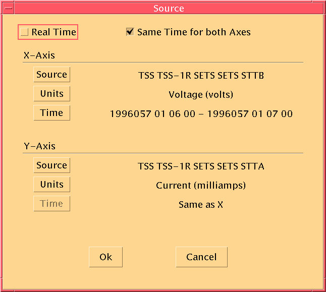
Click on the Add button to add a new source to the plot. When you click on
Add, the following dialog appears: 
As you can see, each axis has its own Source, Time, and Units buttons.
These buttons bring up the standard dialogs so pick through the hierarchy
as you normally would.
The only variations are the "Real Time" toggle and the "Same Time for both Axes" toggle. If "Real Time" is checked, the data will be collected from the real time data area. You are unable to select any times.
If the "Same Time for both Axes" toggle is selected, only the X-Axis needs to have its time specified. It will be used for the Y-Axis as well.
Deleting will remove a source from the plot and all associated with it. This operation can not be undone so be careful... Select a line from the list above the button and click "Delete" to remove it.
After a source has been defined, you may change it to suit your needs. Select a line and click "Modify" to modify the source.
There are a myriad of options available to tune the plot. The options affect the plot on the whole except for the Point/Line options which operate on a single line on the plot.
These options are the most general options available.
The first option is to switch between cartesian and polar plots. The default is the cartesian plot.
The next option can change the plot from color to monochrome. Default is color.
Tics and Lines are by default on for the major and minor axes. Any or all can be turned on or off.
There are six different fonts available :
Each font can be specified in size and have either bold or italic attributes applied to them. The defaults are :
To change a font, click on the appropriate button describing which font you wish to change. The font will be selected on the top part of the dialog. Make your changes and then click on the "Apply..." button to make the changes take affect.
To change the labels, click on the appropriate label field and type what you wish the label to be. If you want the label to not be shown, uncheck the "Show" button.
The Correlogram is capable of drawing markers at each data point. There are 19 predefined point marker definitions:
| Description |
|---|
| no point marker drawn |
| open circle |
| square |
| triangle (pointing up) |
| triangle (pointing down) |
| triangle (pointing left) |
| triangle (pointing right) |
| diamond |
| hourglass shape |
| bowtie shape |
| filled variants of the above... |
Furthermore, each point can be one of five colors. They are black, red, blue, green, and cyan.
Lines function the same way. They can also be one of the same five colors and one of the following styles : none, solid, dotted, and a wide dotted line.
The default point/line style is a hollow black circle with no line connecting the points.
The legend can be turned on or off. Check or uncheck the "Show Legend" button. Default is on.
The legend line size is the length (in pixels) of the small lines used to show the line style and color in the legend box. The default is 16 pixels.
The legend margin sets the border margin (in pixels) between the legend box outline and anything contained in it. Also controls the spacing between the line sample and the text, and the vertical spacing between legend entries. The default is 3 pixels.
The margin value is the spacing (in pixels) of the plot with the border of the widget. The default is 5 pixels.
The title margin is the spacing in pixels between the plot and the title. Default is 8 pixels.
This program could not have been written with the help of some free widgets which were picked off the net. The one used in this program is SciPlot v1.36 by Robert McMullen. It is available at http://www.ae.utexas.edu/~rwmcm/SciPlot.html
Portions Copyright (c) 1996 Robert W. McMullen
Portions of the SciPlot Widget source code, as marked, are: Copyright (c) 1993 Alan Richardson (mppa3@syma.sussex.ac.uk)